HTML | CSS
HTML, CSS로 반응형 UI 만들기 (웹앱, 다크모드)
멈머이
2025. 7. 30. 22:33
728x90
*주요 구현 내용
| 반응형 너비 | width: 100%; max-width: 400px |
| 모바일 대응 | 미디어 쿼리로 폰트/패딩 조절 |
| 중앙 정렬 | flex 사용 |
| 다크모드 대응 | prefers-color-scheme 사용 |
| 디자인 | 그림자, 버튼 호버, 둥근 모서리 |


* .HTML 코드
<head>
<meta charset="UTF-8" />
<meta name="viewport" content="width=device-width, initial-scale=1.0" />
<title>반응형 로그인 페이지</title>
<link rel="stylesheet" href="style.css" />
</head>
<body>
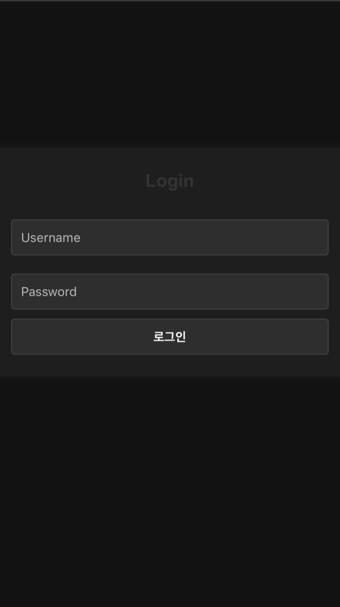
<div class="login-container">
<h2>Login</h2>
<form>
<input type="text" placeholder="Username" required />
<div class="password-wrapper">
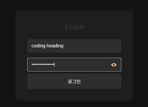
<input type="password" id="password" placeholder="Password" required />
<span class="toggle-password" id="togglePassword">👁️</span>
</div>
<button type="submit">로그인</button>
</form>
</div>
</body>
* .CSS 코드
    /* 공통부분 */
    * {
        margin: 0;
        padding: 0;
        box-sizing: border-box;
    }

    body {
        height: 100vh;
        display: flex;
        justify-content: center;
        align-items: center;
        background: #f4f4f4;
        font-family: 'Arial', sans-serif;
        transition: background 0.3s;
    }

    /* 로그인 박스 레이아웃 */
    .login-container {
        background: white;
        padding: 40px;
        border-radius: 8px;
        width: 100%;
        max-width: 400px;
        box-shadow: 0 0 15px rgba(0, 0, 0, 0.1);
        transition: all 0.3s ease;
    }

    .login-container h2 {
        margin-bottom: 20px;
        text-align: center;
        color: #333;
    }

    .login-container input {
        width: 100%;
        padding: 12px;
        margin: 10px 0;
        border: 1px solid #ccc;
        border-radius: 4px;
        font-size: 16px;
    }

    .login-container button {
        width: 100%;
        padding: 12px;
        background: #007bff;
        color: white;
        border: none;
        border-radius: 4px;
        font-size: 16px;
        cursor: pointer;
        transition: background 0.3s;
    }

    .login-container button:hover {
        background: #0056b3;
    }

    /* 다크 모드 */
    @media (prefers-color-scheme: dark) {
        body {
            background: #121212;
        }

        .login-container {
            background: #1e1e1e;
            color: #eee;
            box-shadow: 0 0 10px rgba(255, 255, 255, 0.05);
        }

        .login-container input,
        .login-container button {
            background: #2e2e2e;
            color: white;
            border: 1px solid #444;
        }

        .login-container input::placeholder {
            color: #bbb;
        }
    }

    /* 모바일 최적화 */
    @media (max-width: 480px) {
        .login-container {
            padding: 24px;
        }

        .login-container h2 {
            font-size: 20px;
        }

        .login-container input,
        .login-container button {
            font-size: 14px;
            padding: 10px;
        }
    }

    /* 비번 토글보기 */
    .password-wrapper {
        position: relative;
        width: 100%;
    }

    .password-wrapper input {
        width: 100%;
        padding-right: 40px;
        /* 아이콘 들어갈 공간 */
    }

    .toggle-password {
        position: absolute;
        right: 12px;
        top: 50%;
        transform: translateY(-50%);
        cursor: pointer;
        font-size: 18px;
        user-select: none;
    }
* .script 코드
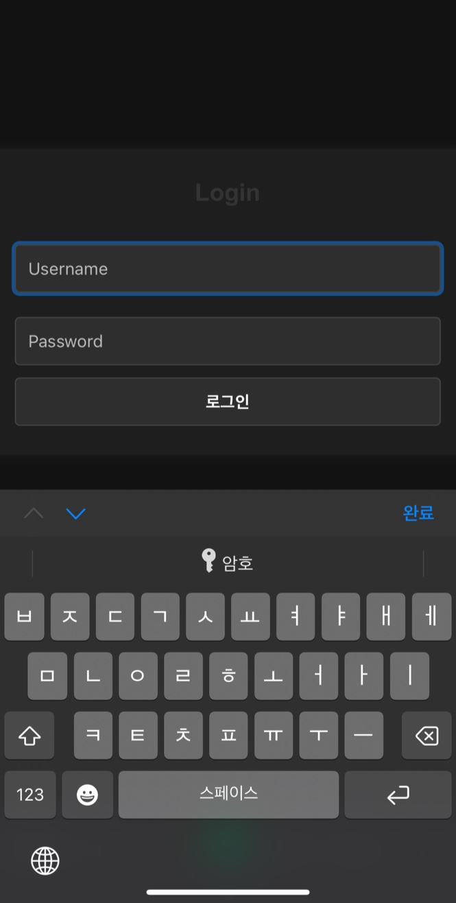
    // 키보드 올라올 때 스크롤 보정
    window.addEventListener('resize', () => {
        document.body.scrollIntoView({ behavior: 'smooth' });
    });

    const toggle = document.getElementById("togglePassword");
    const passwordInput = document.getElementById("password");

    toggle.addEventListener("click", () => {
        const type = passwordInput.getAttribute("type") === "password" ? "text" : "password";
        passwordInput.setAttribute("type", type);
        toggle.textContent = type === "password" ? "👁️" : "🙈";
    });
✔ 모바일 기기에서 가상 키보드가 올라오면 input이 가려지는 문제가 생길 수 있으므로 JavaScript로 해결.

728x90